 Anyone that knows me, has met me or even has read this blog for any length of time knows that I'm quick point out the flaws and problems with our city and it's leaders.
But one thing I think our city got right is the design of our new main library downtown. It is beautiful not only in it's design, but also it's functions. Add to that the influx of young bright and creative talent that cares not only about the library but also how the library interacts with the community. And you have what is (in my opinion) the one of the very few shining stars in the city of Jacksonville.
A couple of months ago the library started a whole new collection called the Zine Collection. Zines are usually self-published pamphlets and have been the underground reading material for the geeks, dweebs, hipsters and all-a-round general flunkies for the last couple of decades.
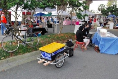
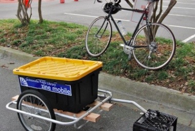
Not content with just starting the Zine Collection. Josh Jubinsky (Pictured above) and others of that young bright and creative talent mentioned above wanted to bring those Zines from the underground and into the light for the masses. How do they do that? Well, you load the Zines on to a modified trailer and bike to events like the Riverside Arts Market.
 And that is how a library full of outstanding individuals rolls.


3 comments:
that is so utterly COOL! another reason why I love the JPL. they are doing a spectacular job. not only is it an amazing space, but the staff is so obviously trying to reach out to their borrowing public and give them what they want. to go there on a Saturday is to truly see that it serves as Jacksonville's public marketplace of ideas. i think they are more in tune with the city than many of it's more vested and traditional institutions.
My only gripe with this post is the notion that the Main Library is a good design. As an Architect-to-be, i have to say the city failed miserably when it came to constructing a new library downtown. This was an opportunity to build a truly signature piece of architecture in the downtown skyline and what we got instead is the same old crap institutional architecture, albeit with nice aluminum storefront, that you see everywhere from time immemorial. There was certainly enough money in the budget for that project to accommodate something of truly prodigious stature. But as usual, the city failed us. I think it is great that they libraries try to reach out to the public and get people engaged, as is always important for any city. But the building itself is not good architecture.
Jeremiah "Howard Roark" Russell has a point. I personally do not like external architectural elements with fake pieces pasted to it to add fake historical value.
I do like the flow inside the library. And the courtyard.
Post a Comment